TransMedia Show Website Posted on Apr 15th, 2014
What is TransMedia?
TransMedia is an annual event held in association with the University of Winchester. It's purpose is to allow students on the Digital Media course to engage with industry.
The event consists of students showcasing their work undertaken while studying their degree. This encompasses the first, second, third & masters students.
The event also hosts a 'pitch your project' competition, which is included as part of the third year assessment. This post shall present the process I took, in creating websites for the event.
Backstory
The event has ran for four years now. During the first two years, the event did not have a website or web presence. This obviously affected the marketing of the event and in effect reduced engagement with outside industry.
In 2013 I was an hourly paid part-time lecturer, working on the Digital Media Development couse. I decided to volunteer (in my spare time over the Summer) to create a simple website for the university to promote this event. My reason for doing this, was primarily to help the students engage with industry and ultimately help them find jobs / placements. Having been through this process myself, I understood the importance of having industry attend the event.
I then revisited the website in 2014 and revamped the site.
Problem
As mentioned the event did not have a existing website and had very little online marketing material.
I created one site for the 2013 event, then another for 2014.
The process below will largely document the 2013 website. As for 2014, the branding was kept consistent.
So I set out to create a simple website that was in keeping with the existing branding.
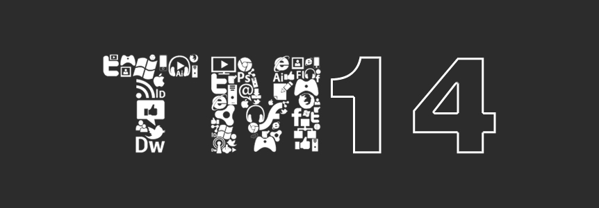
At this point the branding was fairly non-existent, except a logo that was created by Valia Kalfa (at the time a second year student).
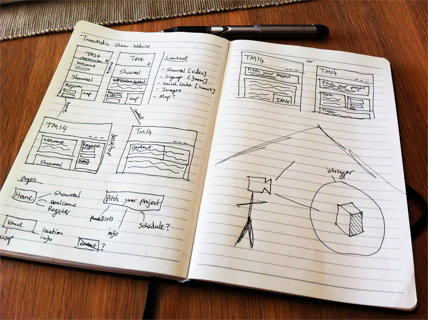
At this stage I had a fairly blank slate to start with. So I sketched out some layouts based around what content I believed we might have available.
As this was also my Summer side-project, I decided to indulge in some development frameworks that had peaked my interest during the year.
For the backend I choose to explore Laravel, a PHP framework using the MVC software pattern. A few reason for picking this framework:
- I was personally interested in the framework.
- It was compatible with the server we currently had.
- It had nice features such as migrations, similar that found in Ruby on Rails.
- Compatible with my existing deployment process (Capistrano), so ideal for professional future maintainance.
As for the front-end, I decided to check out the latest version of Twitter Bootstrap (at the time version 2). A few reasons for selecting this:
- Speed of use.
- A responsive grid system, ideal for cross browser & device useability.
- Ability to rapidly prototype ideas and experiment.
The design process for this project mainly took place in a browser. This was due to the fact I wanted to make use of Twitter Bootstrap's ability to quickly prototype layouts and assets. Also it allowed me to further explore the framework and acquaint myself with the components available.
The decision to keep the design phase in the browser worked in this instance, because no client was technically involved.
I was also experimenting with colours and fonts in the environment they would be used - a browser.
I suppose the downside of a quick workflow like this, is that it's hard to preserve a progression of ideas.
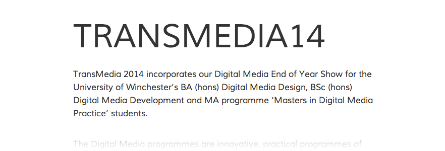
After much experimenting and exploring on Google Fonts, I decided upon the font pairing of:
I feel the choosen fonts have a clean and fairly neutral look, but also have a modern feel compared to most default fonts.
Moving onto colours, for the primary colour a dark blue was selected. Primarily for the reason it has a neutral feel and gives off a professional look.
I explored other colours (as seen below), as I wanted to do something eye-catching for the website.
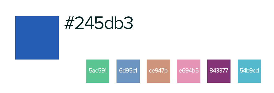
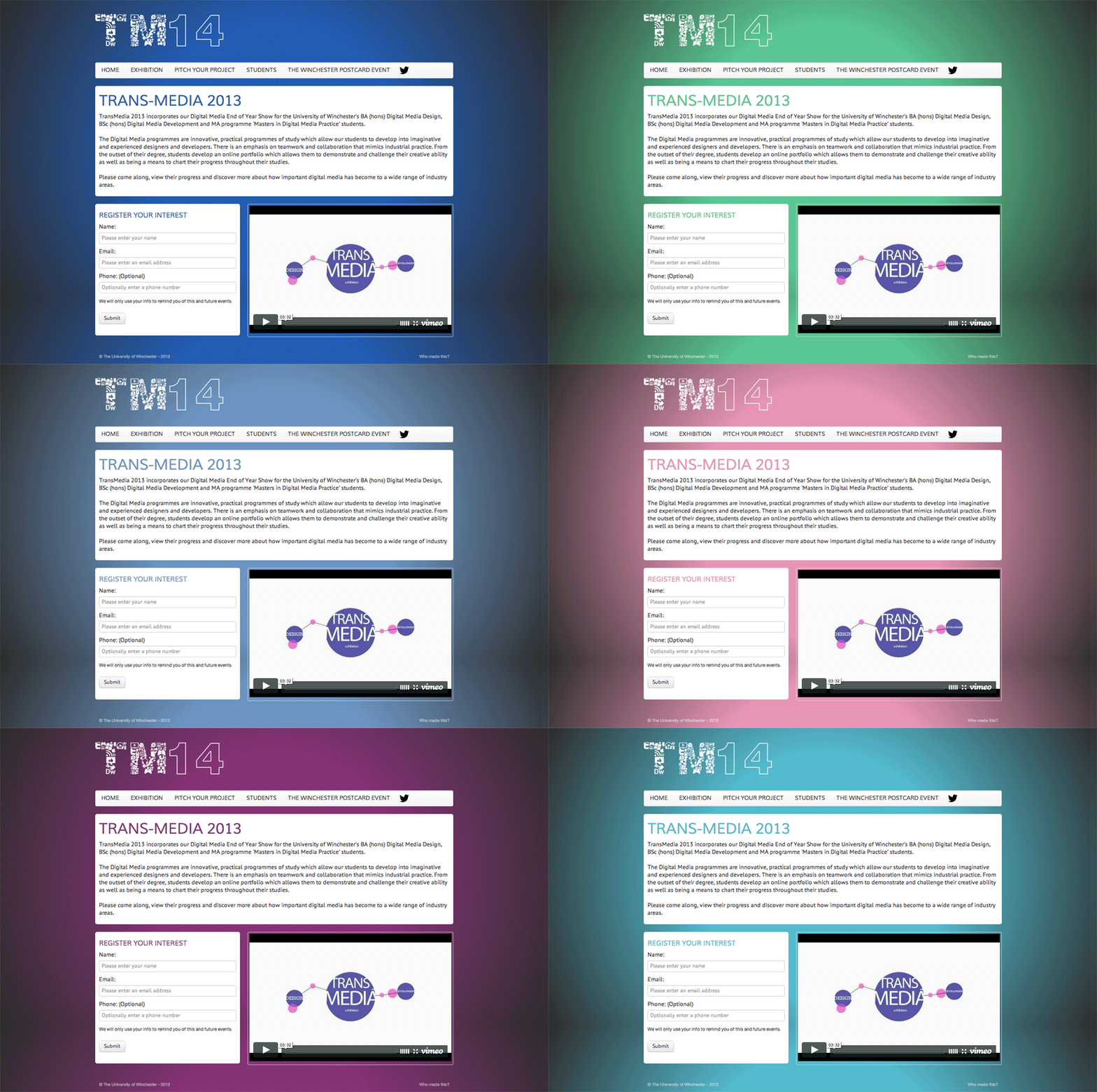
I used this palette to randomise the brand colours of the website. This was a technique I used on my personal portfolio website at the time - and received good feedback from doing so.
I felt the technique would be suited to this website, as this one website had to cater to all the students different personalaties and styles.
Outcome
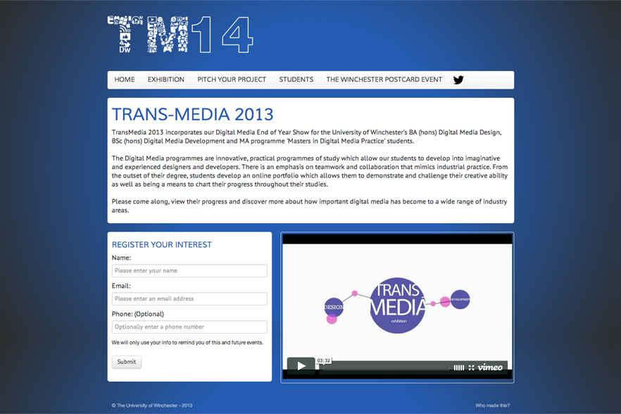
Here you can see the final outcome of the project (the logo should read TM13, but at the time of blogging I had already updated the logo).
I decided to go for a modular layout regarding the content. This allowed more flexibility when adding more content in the future.
Below you can also see the changing colour palette when the browser is refreshed (Please excuse the .gif quality).
Update
Since the TransMedia 2013 show, I have once again visited the website over my Summer break.
For the 2014 show, I choose to re-develop the website using WordPress for the backend and Zurb Foundation for the front-end.
My reason for this was that while the 2013 website had a CMS and was quite easy to use, end-users and students seem to prefer the look and feel of Wordpress.
As for switching out Twitter Bootstrap for Zurb Foundation, this was just a personal preference - largely due to Zurb Foundation including HTML5 form validations as standard.
The TransMedia-2014 website can be viewed here & below.
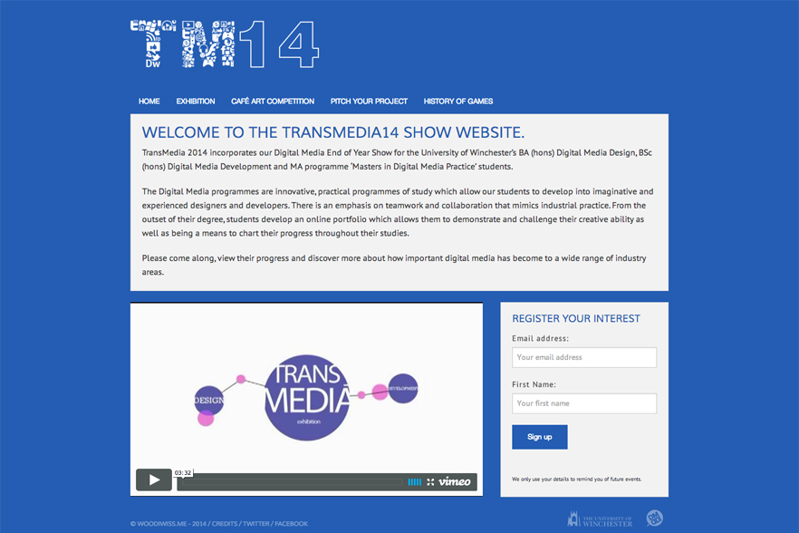
You might notice that I have also removed the alternating colours, I believe simplifying the colour palette will help the brand in the long-term.
Reflection
Having given the TransMedia Show a web presence, I feel happy with the outcome. I feel the end result could be much better, but given the timeframe and resources - It does the job.
From the 2013 website to the 2014 website, it always feels like a mad dash to get it done in time. This is usually due to varying reasons, but hopefully going forward this is a solid base for the website to grow.
It's hard to weigh up the outcome in a statistical format, as promoting a show relies on many people and many different factors.
3.15% more visitors are exploring additional pages of the website (bounce rate, lower = better).
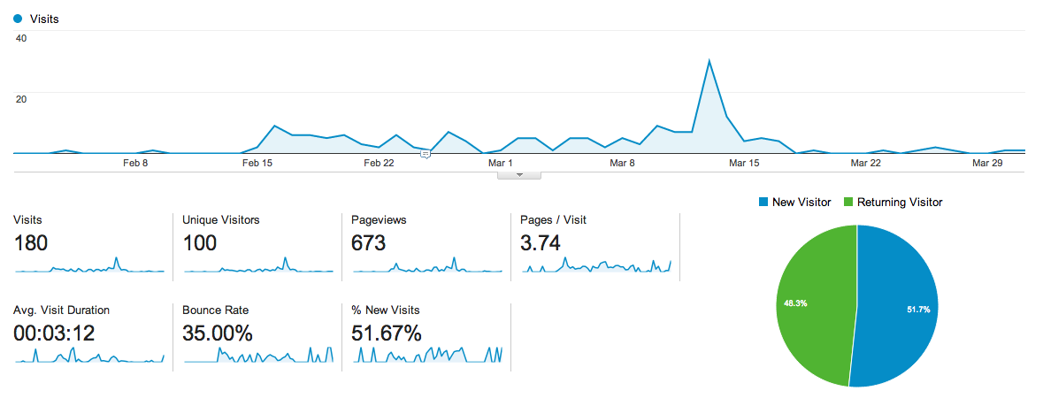
Below you can view the Google Analytics of the site to date.
The initial spike was the 2013 website & then second being the 2014 website.
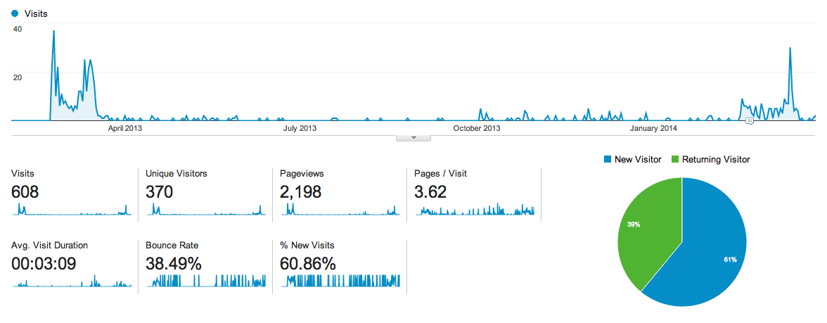
Unsatisfying the 2013 website generated more unique visitors than the 2014 website. But again this is most likely due to the marketing channeling traffic to the website.
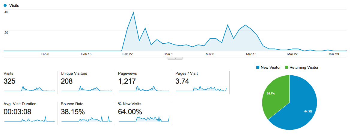
The data I find the most interesting is the 'Average Visit Duration' and 'Bounce Rate'.
The average visit length has increased by 1.3%
And 3.15% more visitors are exploring additional pages of the website (bounce rate, lower = better).
All in all I am glad that I took on the task of looking after the TransMedia website. I feel it has been beneficial to the Digital Media course at The University of Winchester, while also beneficial to the students.
Hopefully for 2015's event, a better website will be in place. But ideally the existing website will now set the foundation.
Thanks for taking the time to read :)